Recently I posted what I thought was quite a nice map of world languages, here.
Here is a very similar graph, but this time of Gross Domestic Product:
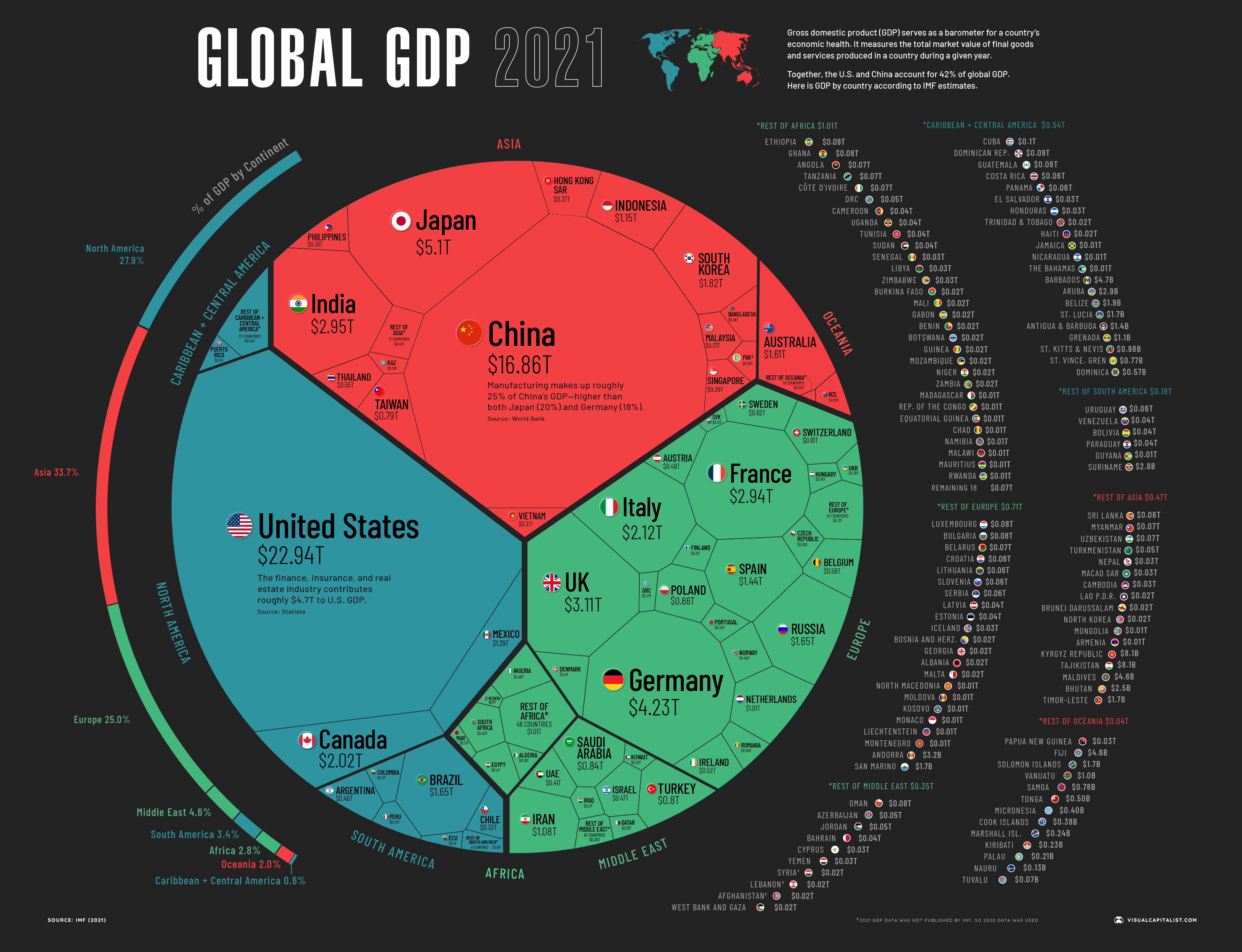
I am not a Grossdomesticproductician, but I do think a graph of this nature could be confusing. It compares GDP that has been converted to a single currency, but it strikes me that looking at it in its natural setting of its own buying power could be more insightful.